March 1, 2024
MiPasa - Data Modelling & Analytics Platform
The company and product
MiPasa, built by Hacera, is a data analytics platform that enables organizations to securely share, analyze, and automate insights through Python notebooks, a no code visualization canvas, and a simple pipeline builder.
When I joined MiPasa, the platform was mainly an online notebook editor with collaboration features, but it was heavily code-first. Non-technical users struggled to manipulate data, features lacked consistency, the product vision was unclear, and the platform needed to grow beyond notebooks into a complete data analytics solution.
My Contributions
On the design side, I worked within MiPasa's existing design system and contributed to its evolution. I designed new features and components, moving from user flows all the way to developer handoff. I also improved the design system to make it more consistent and scalable, and collaborated closely with designers and developers to ensure smooth implementation.
On the data side, I used MiPasa itself to create dashboards and reports on DeFi and crypto data. These dashboards served as concrete examples of how the platform could be used and many of them remain usable today, powered by live data and simulations. This work helped demonstrate the value of MiPasa through real-world applications rather than abstract features.
Dashboards and Reports
One of the dashboards I built tracked a stablecoin leverage strategy. The strategy started by depositing sDAI on Aave on Gnosis, benefiting from the high fixed rate on sDAI enabled by Maker's multiple revenue sources. The next step was to borrow DAI, swap it into sDAI, and repeat the loop. At the time, this could be automated with the Contango dApp, which did not charge any fees.
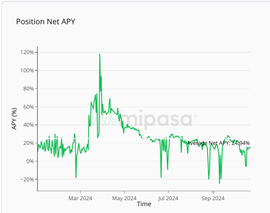
The above chart shows the performance of the strategy over time, including an average APY (Annual Percentage Yield). The strategy was juicy back then.
The dashboard displayed the relevant interest rates over time, the accumulated capital if the strategy had been started on a specific date, and key risk metrics such as liquidation price and health factor. It also included alerts to indicate when the strategy was no longer profitable.
Landing page redesign
Alongside product work, I redesigned MiPasa's public landing page to better communicate the product vision and capabilities. The new design focused on clarity, consistency with the product design system, and a more modern aesthetic to position MiPasa as a professional and trustworthy platform for data analytics.
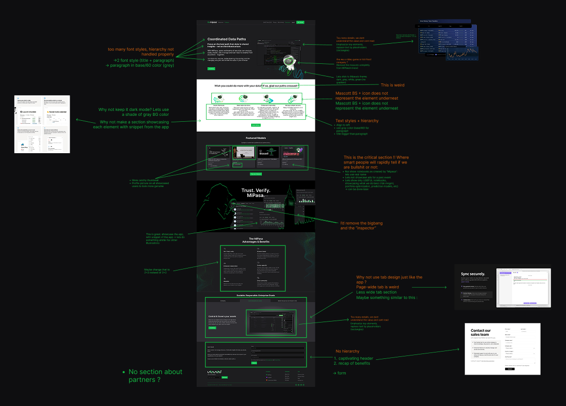
Before: issues identified
Some of the specific issues I identified:
- Messaging was dense and unfocused: the value was lost in too much detail.
- Font styles were inconsistent, and text hierarchy was not handled properly.
- Visual identity was confusing, with mascots that felt out of place for a data analytics product.
- The color palette did not align with MiPasa’s brand (dark, grey, white, green) and gradients added unnecessary noise.
- Critical sections, such as user showcases, lacked authenticity: notebooks were shown as “created by MiPasa” rather than by real people, and profile images were missing.
- Some content was outdated (ads for past events) or irrelevant (mascots, “big bang” graphics, “inspector” character).
- Layout decisions such as wide tab sections, icons unrelated to their content, and poorly structured grids made the page feel cluttered.
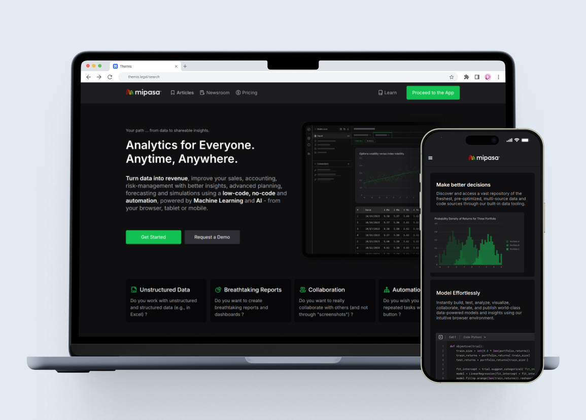
After: The redesign
Main improvements I introduced:
- A clear headline and concise value proposition at the top.
- Simplified typography with only two styles: large bold titles and grey body text for readability.
- Removal of mascots and unrelated icons in favor of snippets directly from the app.
- Consistent dark theme with white, grey, and green accents, staying true to MiPasa’s identity.
- A stronger header section, recapping the platform’s core benefits right away.
- Authentic user showcases with profile pictures and real notebook authors instead of placeholders.
- Updated sections to highlight relevant notebooks, focusing on MiPasa’s strengths such as risk management, portfolio optimization, and prediction models.
- Improved layout with better use of grids, more balanced tab sections, and visual placeholders to emphasize hierarchy.
- Addition of a partner section to reinforce credibility.
Outcome and Impact
My design work helped shift MiPasa from a code-first product to a platform accessible to non-technical users. People could manipulate data without writing code, build multi-chart visualizations directly in the interface, and create pipelines through simple UI interactions. By improving and rationalizing the design system, I also contributed to better consistency and scalability across the platform.
The dashboards and reports I built for DeFi and crypto became important proof points of MiPasa's potential. They showed how the platform could deliver practical insights and demonstrated its capabilities to stakeholders and users.
Unfortunately, I cannot show the UI or the dashboards themselves, as the platform is private and I do not have the rights to share them.
Learnings
I learned how to work within an existing design system while extending it with consistency. I gained experience in making complex technical features approachable and user-friendly. I also learned how to balance usability goals with developer constraints, and how to showcase the value of a product through real-world use cases.

